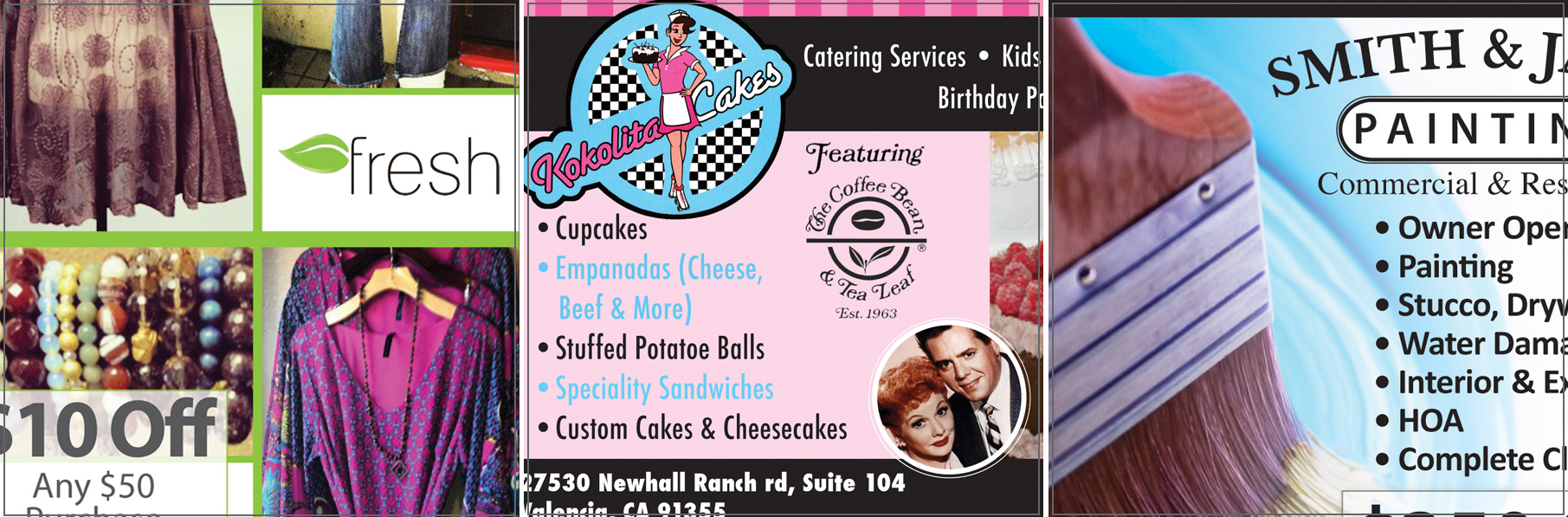
Ongoing work for Look Magazine
I’ve been working with Look Magazine for over 3 years now! What started with only designing a few ads, has now developed into Migrate Design being in charge of all the ads’ creation as well as the magazine layout!
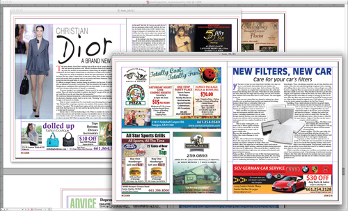
The main purpose of this magazine is to promote local business in various Southern California cities from Orange County to the Santa Clarita Valley.
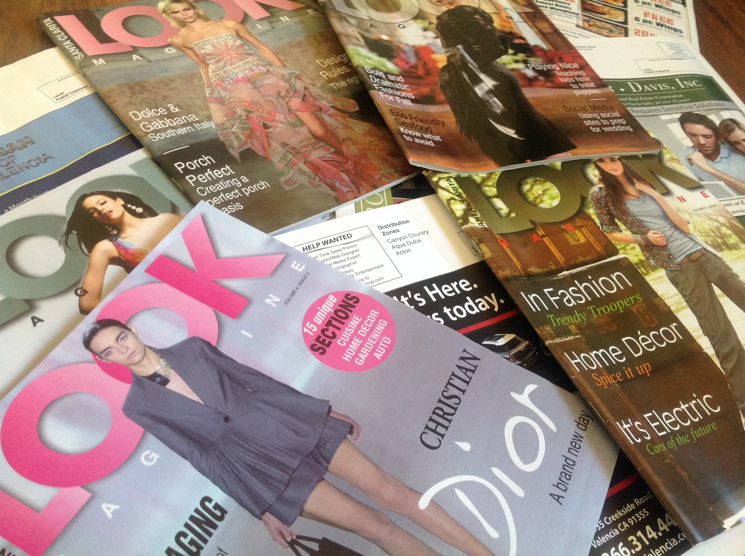
Make sure to Look for the next issue in your mailbox and take advantage of the many offers inside to support small businesses!
You own a small business and wonder how you can boost your foot traffic and improve your sales? Contact Migrate Design to discuss the advertising options available to you.
Filed under Advertising, Art, Article, Branding, Brochure, Marketing, Print, Retail, Self-Promotion, Uncategorized | Comment (0)Letterhead Is Not Dead!
With the explosion of the internet, most of our communication is made through email, text and social media. Regular mail seem like a slow, inefficient thing of the past… However, I think every business should have corporate identity elements like a letterhead and business card to maintain its image. These elements show that your business is established and serious. They help provide trust and credibility.
Your letterhead should of course include your logo, which is the most important element of your visual identity and be consistent with your other branding elements. (You don’t have a logo? Contact Migrate Design as this is where you need to start… )
Your letterhead should be printed professionally and include all your contact information: address, phone, email and website address.
Website, email and social media are crucial in today’s world, but a professionally printed corporate letterhead is just one more element that will define your brand and image to your clients.
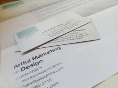
Here’s a peak at my latest letterhead and business card design for Gallery Kara.
Filed under Advertising, Article, Branding, Letterhead, Marketing, Migrate News, Print, Retail, Self-Promotion | Comment (0)The Importance of Advertising for Local Businesses
“A man who stops advertising to save money is like a man who stops a clock to save time.” ~ Henry Ford
Can you imagine what would happen if you stopped your clock just to give you more time? You might get the illusion of accomplishing more but ultimately, you would get left behind, especially in a world and era as fast paced as ours.
In today’s economy, business owners are sometimes reluctant to spend money on advertising, not realizing that it is the key to making their business move forward and increase sales. Worse yet, they are even not aware of the new openings for marketing that internet creates. One of the most overlooked promotional methods would be social media marketing, that is hiring a professional company like pistachioconsulting.com, who can greatly boost your popularity on social media and thus increase your sales.
Here are a few reasons why you should advertise.
– Not everyone knows who you are: Your business might have been established for years or just a few months, but chances are, people don’t know you yet. Families are moving in and out of cities and you need ways to let them know about you.
– Let them know you’re still in business: Just as people move in and out of cities, businesses open and close, especially in today’s economy. Regular advertising will let your customers know that you’re still here to serve them.
– Competition is fierce: You might see competition only as other businesses or products of your type, but really, competition is anything consumers are spending money on. Advertising will help you stand out from the crowd.
– Generate traffic: Steady traffic is the first step towards increasing sales and expanding customer base. Make your potential customers curious about a new product or service and offer them a discount. The more customers through the door, the better chance of a sale and a referral.
– Turn wants into needs: Convince people that they need your service or your product by creating catchy advertising and having a consistent presence, either in local magazines, mailers, billboards…
– Save your customers time and energy: Especially in today’s economy, you need to be there when consumers are ready to purchase. If they have been repeatedly exposed to your message, they won’t have to spend time researching, they will come to you when they need you.
– Keep your image strong: Your business is more likely to be chosen if you have provided a strong, reliable image that sticks in people’s head. As I mentioned in a previous post, visual identity is key, make sure your advertising follows the trends of the moment.
– Move forward: Advertising is the perfect tool to make you stand out and help you move forward by getting recognition and increasing sales. Don’t see it as a cost but as an investment in your business.
There are many more reasons I could mention, but the bottom line is: advertising is important. It’s like an invitation for your potential customers to come see who you are and what you have to offer.
Contact Migrate Design to discuss the many advertising options available to you and your business.
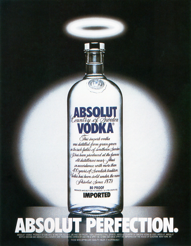
Filed under Advertising, Article, Branding, Marketing, Retail, Self-Promotion, Uncategorized | Comment (0)Absolut Collection
In the early 90’s, I fell in love with the simplicity and cleverness of the Absolut Vodka ad campaign. I became Absolutely obsessed and started my “Absolut Collection”.
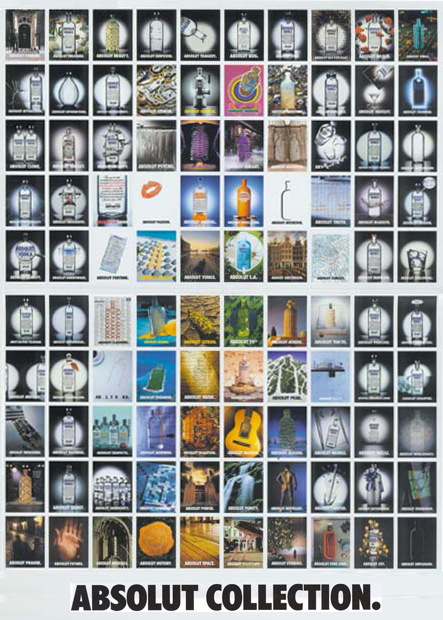
Did you know that Absolut vodka has been running essentially the same print advertising campaign for 25 years? All 1,500 of the ads in the campaign feature or make sly reference to Absolut’s distinctive bottle, with the stubby neck and see-through label. All also use variations on the two-word tagline used in the original ad, which shows the bottle with a halo above the words Absolut Perfection.
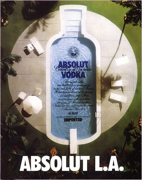
Over the years, the bottle’s profile has been used to mimic, for example, a ski slope, a polygraph’s printout and the rotund frame of Alfred Hitchcock. There have also been regional variations, including a bottle-shaped swimming pool for the Los Angeles market and a bottle in the shape of New York’s Central Park. In Philadelphia, Absolut ads offered a likeness of Ben Franklin wearing bottle-shaped spectacles.
Contemporary artists such as Andy Warhol and Keith Haring have done ads for Absolut and the company has run ads painted in the style of Rubens and other old masters. Fashion designers Gianni Versace, Helmut Lang, Manolo Blahnik and Anna Molinari have created clothing for ads and promotions; celebrity photographers Herb Ritts and Annie Liebowitz also have taken part. Ads have incorporated album covers from David Bowie, Miles Davis and the Velvet Underground.
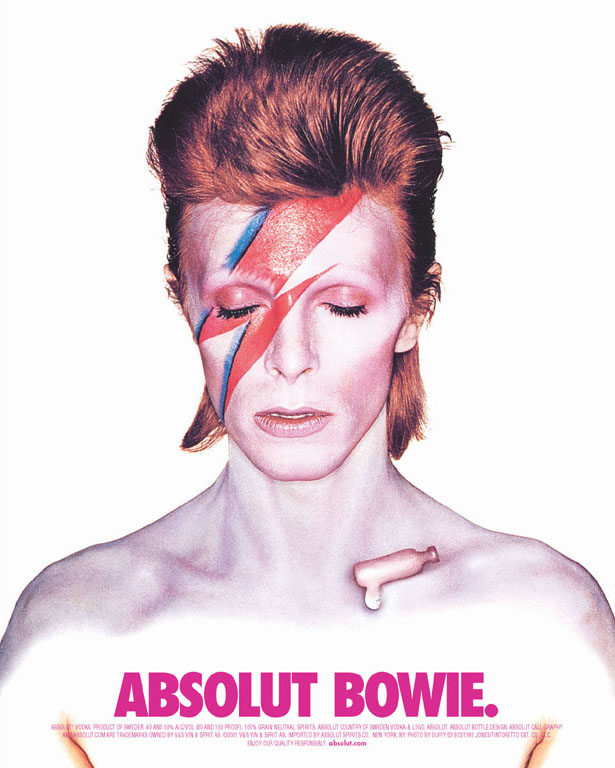
Even though this original campaign came to an end in 2006, I’m still eager to grow my collection – a little over 200 prints so far. So if you come across an Absolut ad, think about me !
If you’d like to see more, don’t forget to visit the “Absolut Gallery”

Filed under Advertising, Art, Article, Marketing, Print, Retail | Comment (0)
Your Logo, Your Identity.
Why is having a logo so important?
A logo is a symbol or small design used to identify an organization, a business or even an individual, product or service. A logo is what gives you a visual identity and we all know how important it is in today’s world. Take a look at the logo of our friends at Fully-Verified for an example. The circular arrows stand for the transition from the unknown party to the known, while the saturation with green gradient invokes connotations of smooth traffic and safety – exactly what their services stand for.
Relevant: Wether you want it very obvious or more subtile, your logo needs to relate to your company’s services, products or its name, one way or another.
Representation: Your logo is your image, so whatever you want your potential customers to know about your company, your logo should represent it. Make it look professional, stylish and smart – or fun, grungy and smart.
Memorable: A smart logo is a memorable logo, and by smart I mean simple yet able to deliver a message. It needs to grab people’s attention quickly and stay anchored in their minds.
Color: Choosing the right color is important but once again, less is more and a logo should work in black and white as well as in color.
Identity: So you have the perfect logo… Now what? Use it as your visual identity and spread it. Business cards, flyers, brochures, ads… you name it! The more present your logo is in your community, the more chances people will hire you or buy your products!
So, are logos important? YES! The moment you try to reach people and you want them to remember you or your business, you need a logo. Every business, as small as it might be, should have one.
What if you already have a logo but you’re not happy with it? Even though you shouldn’t change your visual identity too much – just like you wouldn’t change your name – it’s never too late to give it a small makeover. Visual trends change over the years and once your logo is established, it’s okay to change it to make it fit the times better. Pepsi is a good example for this type of design evolution.
Migrate Design can help you create something unique and memorable. Don’t be shy, get your visual identity out there!
Water Works Plumbing is the perfect example of logo makeover! From complicated and outdated, to simple and modern, Migrate Design gave this logo, a fresh new start.
Logos With A Hidden Message
As a graphic designer, I do have an appreciation for logos with substance, both attractive and compelling. Creating a logo is far from being easy. It takes time and generally requires lots of trials and errors. The design process consists of experimenting [playing] with various ideas and combinations until finding the most effective image.This process can take hours, even days, but the result is so worth it! I’ve collected a few corporate logos that feature a hidden message. Let’s see if you can find them ;)

The arrow is cleverly drawn in the shape of a smile. But that’s not all! It starts under the letter A and ends under the letter Z. Amazon has everything from A to Z!

See the number 31 embedded in the “B R” ?? Thirty one-derful flavors !!!

This looks like a very simple logo, but there’s an added layer that makes it one of the most ingenious logos of all time. Do you see the white arrow between the “E” and “x” ??

Smiles are good! They convey a positive attitude and happiness all around… always a good idea if you can make it work. For Goodwill, that smiley face is also the letter “g” !!

If you’re a chocolate fan, this one is a no-brainer. There is a sideways chocolate kiss between “K” and “I” !!

Le Tour de France is the world’s most famous bike race. The “R” in “Tour” is a cyclist, and the yellow circle represents the front wheel of the bicycle.

Toblerone chocolate bars originated in Berne, Switzerland, whose symbol is the bear. Look closely at the image of the Matterhorn… can you see the bear ??

The 2nd and 3rd “t’s” are two people sharing a tortilla over a bowl of salsa.

Northwest Airlines. The circle is a compass. Guess which direction the arrow in upper left corner (or beginning of “W”) is pointing ???

This back and white logo isn’t just a tree… look carefully… See the gorilla and the lioness facing each other ??

Carrefour is one of the largest hypermarket chains in the world. Its logo is very fashionable and timeless. At first blush, we can see two arrows pointing away from each other. But if you keep looking, you might find the hidden “C” !!

This logo was designed by a college art student. it used to be the emblem for the Milwaukee Brewers. The baseball glove forms an “M” and a “B”.
That’s it. I hope you enjoyed this humble collections of classic logos as much as I did writing about them. I find them very stimulating, and they are always an inspiration for my own creations.
Filed under Article, Branding, Logo Design | Comment (1)Local Internet Marketing
 Are you feeling overwhelmed by the multitude of online marketing choices?
– You’re not alone!
Google Places, Bing and Yahoo Local offer basic business listings, as well as paid listing options. If you are trying to boost sales and increase local presence within your competitors, the following list will quickly and simply let you grasp all the local online marketing options available to you.
1. Local SEO – Gain top rankings in the natural or organic search engine listings for keywords that also contain a city or region name (i.e. “Santa Clarita SEO specialist”).
2. Pay-per-click Advertising – Create and place ads strategically on the Internet where people are looking for products and services within a given local area. When someone clicks on your ad, it sends them to your website and only then are you charged for the ad listing.
3. Pay-per-call Advertising – Similar to the pay-per-click advertising model, except having a website is not necessary. When someone calls the number on your ad, only then are you charged for the ad listing.
4. Local Directories – Listings and links in various online directories, including online yellow pages targeted to your locale, online yellow page advertising.
5. Fixed Placement Buys – Create and place ads strategically on Internet sites where people search for products and services within your local area.
Whether you’re looking to drive traffic to your site, fill your sales funnel with prospects or increase revenue – or all of those – the options listed above can help you meet your Internet marketing goals.
Migrate Design will guide you through various SEO procedures and help you with all your graphic design needs. Call us for a free consult.
Filed under Advertising, Article, Branding, Marketing, Search Engine Optimization, Self-Promotion | Comment (0)Pacific View Remodeling Magazine Article
Go to page 172 of the Santa Clarita Magazine and you will find an article titled “From Design To Completion”, along with a quarter page ad.
A few weeks ago, We designed a brand new logo for Pacific View Remodeling, and we are in the process of building a website. As this remains one of the most important part of marketing, there is a strong need to complete static presence with a more targeted advertising style. Our client is using cross-promotion very efficiently and successfully, as one piece always links to the others. This method increases popularity, both in the community and online, and builds credibility with the consumer.

The Apple Logo
 The first Apple logo was designed by Ron Wayne, co-founder of Apple Computer. It was rather a picture than a logo. It showed Sir Isaac Newton sitting beneath the famous Apple tree thinking about gravity. It was only used for the Apple I. Steve Jobs felt that it was too intellectual and it was almost impossible to put on computers as one could only recognize the details of the drawing when it was large enough.
Therefore, in 1977 Jobs asked the art designer Rob Janoff to design the new Apple logo.
 The new logo had a simple shape of an Apple, bitten into, with the colors of the rainbow in the wrong order. The bite symbolized knowlegde (in the bible the apple was the fruit of the tree of knowledge). In 1997, Steve Jobs decided to drop the multi-colored Apple logo and replace it by a solid-colored logo. The first Apple computers to feature the new logo were the new PowerBook G3s in 1998.
Steve Jobs, the visionary in the black turtleneck who co-founded Apple in a Silicon Valley garage, built it into the world’s leading tech company and led a mobile-computing revolution with wildly popular devices such as the iPhone, died today, October 5th 2011. He was 56.
Filed under Art, Article, Branding, Logo Design | Comment (0)Fun Designs Sell Better
 Whether you own a fun arcade game store or a highly corporate accounting business, remember one thing: “fun designs sell better“. Graphic design is a powerful communication and visual medium. It often includes typography, visual arts and page layout techniques, to produce a final product.
Graphic design is everywhere, and it is extremely easy to get lost in this massive visual invasion. One way to differentiate yourself and your brand is to bring fun into the final product. Fun increases brand recall more than any other style or emotion. A fun design can’t be silly or reckless; it needs to be clever and appropriate in order to work its best. It requires a great amount of research and creativity. If done right, it will stand out of the masses. People will remember your design better because of the happy feeling they felt when they saw it. They will share it to friends and family via email and social networks.
Migrate Design can help you create a fun design for your business graphical needs. Call us at 661 644 6518, or email us, and we will show you how happy our designs can be ; )
Filed under Advertising, Article, Branding, Illustration, Marketing, Print | Comment (0)