The Dangers Of The Internet
When you own a small business, your advertising/marketing budget might not be very important, but this is a mistake. Just like any business you should make a reasonable investment in your image, which means safely buying facebook likes from a trusted provider, having a good-looking website and innovative logo among other things. There are more and more sites available for you to create fast, cheap visual identity materials: logos, business cards, postcards, flyers, you name it… Notice how I used the word “cheap”? I didn’t mean it as “inexpensive…” I really meant it as low quality, lacking the research and creativity your business or product deserves.
Not too long ago, I went to a street fair where two of the artisans were making furniture out of recycled wine barrels. They were selling quite similar products but both had unique characteristics to their work. I quickly grabbed their business cards and thought I would check their websites later. A few days later, I pulled the cards from my wallet and this is what I saw…

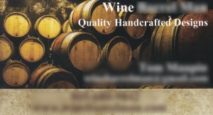
Did I take two of the same artisan’s cards by mistake? No, the names and numbers were definitely different, but which one was which? I had been so impressed by both of their work and now, looking at their business cards, I thought: “This is a joke…” I never called them, I never checked their websites. I was confused and disappointed.
So, how do you make yourself stand out from your neighbor who does the exact same thing you do? Well, you start with a unique logo. It gives your business more credibility and helps potential customers remember you. Don’t go online to create your logo. Sure, you will get it fast and cheap, but so will your competitor.
When you come to Migrate Design for your logo design, there’s a lot of communication involved, we talk, we ask questions. I spend quite some time brainstorming before I even grab my pencil… Pencil, yes! You heard right, the old fashioned pencil and paper.
Your logo starts in my brain, grows on paper and eventually makes it to my computer. I give you options and then I listen to you. It’s YOUR logo, not mine. YOU tell me if I’ve achieved what you were looking for. If you don’t know, that’s okay… I’ve been doing this for 20 years and I’m here to guide you and make sure MY creation fits YOUR needs.
Now you are ready for your business card. Don’t go online! YOUR logo deserves better than being pasted on a stock photography background. I will design and print your business card for you. We can discuss your paper preferences and make sure your card is as unique as your logo.
Now if you’ll excuse me, I have two calls to make. I need to help these two artisans set themselves appart from each other, with two unique visual identities even if they’re doing the same craft! It’s possible!
Contact Migrate Design for all your graphic design needs, you won’t be disappointed!
Filed under Advertising, Branding, Business Card, Letterhead, Logo Design, Marketing, Print, Retail, Self-Promotion, Uncategorized | Comment (0)Your Logo, Your Identity.
Why is having a logo so important?
A logo is a symbol or small design used to identify an organization, a business or even an individual, product or service. A logo is what gives you a visual identity and we all know how important it is in today’s world. Take a look at the logo of our friends at Fully-Verified for an example. The circular arrows stand for the transition from the unknown party to the known, while the saturation with green gradient invokes connotations of smooth traffic and safety – exactly what their services stand for.
Relevant: Wether you want it very obvious or more subtile, your logo needs to relate to your company’s services, products or its name, one way or another.
Representation: Your logo is your image, so whatever you want your potential customers to know about your company, your logo should represent it. Make it look professional, stylish and smart – or fun, grungy and smart.
Memorable: A smart logo is a memorable logo, and by smart I mean simple yet able to deliver a message. It needs to grab people’s attention quickly and stay anchored in their minds.
Color: Choosing the right color is important but once again, less is more and a logo should work in black and white as well as in color.
Identity: So you have the perfect logo… Now what? Use it as your visual identity and spread it. Business cards, flyers, brochures, ads… you name it! The more present your logo is in your community, the more chances people will hire you or buy your products!
So, are logos important? YES! The moment you try to reach people and you want them to remember you or your business, you need a logo. Every business, as small as it might be, should have one.
What if you already have a logo but you’re not happy with it? Even though you shouldn’t change your visual identity too much – just like you wouldn’t change your name – it’s never too late to give it a small makeover. Visual trends change over the years and once your logo is established, it’s okay to change it to make it fit the times better. Pepsi is a good example for this type of design evolution.
Migrate Design can help you create something unique and memorable. Don’t be shy, get your visual identity out there!
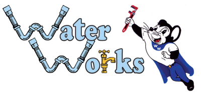
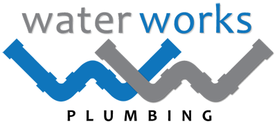
Water Works Plumbing is the perfect example of logo makeover! From complicated and outdated, to simple and modern, Migrate Design gave this logo, a fresh new start.
Frostie Bottom Treestands Logo
Thumbtack.com has been a great resource for Migrate Design over the past year. It allowed us to establish new clients all over the United States.
The latest project was the creation of a logo for Frostie Bottom Treestands, located in Claremont, North Carolina.
![]()
Logos With A Hidden Message
As a graphic designer, I do have an appreciation for logos with substance, both attractive and compelling. Creating a logo is far from being easy. It takes time and generally requires lots of trials and errors. The design process consists of experimenting [playing] with various ideas and combinations until finding the most effective image.This process can take hours, even days, but the result is so worth it! I’ve collected a few corporate logos that feature a hidden message. Let’s see if you can find them ;)

The arrow is cleverly drawn in the shape of a smile. But that’s not all! It starts under the letter A and ends under the letter Z. Amazon has everything from A to Z!

See the number 31 embedded in the “B R” ?? Thirty one-derful flavors !!!

This looks like a very simple logo, but there’s an added layer that makes it one of the most ingenious logos of all time. Do you see the white arrow between the “E” and “x” ??

Smiles are good! They convey a positive attitude and happiness all around… always a good idea if you can make it work. For Goodwill, that smiley face is also the letter “g” !!

If you’re a chocolate fan, this one is a no-brainer. There is a sideways chocolate kiss between “K” and “I” !!

Le Tour de France is the world’s most famous bike race. The “R” in “Tour” is a cyclist, and the yellow circle represents the front wheel of the bicycle.

Toblerone chocolate bars originated in Berne, Switzerland, whose symbol is the bear. Look closely at the image of the Matterhorn… can you see the bear ??

The 2nd and 3rd “t’s” are two people sharing a tortilla over a bowl of salsa.

Northwest Airlines. The circle is a compass. Guess which direction the arrow in upper left corner (or beginning of “W”) is pointing ???

This back and white logo isn’t just a tree… look carefully… See the gorilla and the lioness facing each other ??

Carrefour is one of the largest hypermarket chains in the world. Its logo is very fashionable and timeless. At first blush, we can see two arrows pointing away from each other. But if you keep looking, you might find the hidden “C” !!

This logo was designed by a college art student. it used to be the emblem for the Milwaukee Brewers. The baseball glove forms an “M” and a “B”.
That’s it. I hope you enjoyed this humble collections of classic logos as much as I did writing about them. I find them very stimulating, and they are always an inspiration for my own creations.
Filed under Article, Branding, Logo Design | Comment (1)The Apple Logo
 The first Apple logo was designed by Ron Wayne, co-founder of Apple Computer. It was rather a picture than a logo. It showed Sir Isaac Newton sitting beneath the famous Apple tree thinking about gravity. It was only used for the Apple I. Steve Jobs felt that it was too intellectual and it was almost impossible to put on computers as one could only recognize the details of the drawing when it was large enough.
Therefore, in 1977 Jobs asked the art designer Rob Janoff to design the new Apple logo.
 The new logo had a simple shape of an Apple, bitten into, with the colors of the rainbow in the wrong order. The bite symbolized knowlegde (in the bible the apple was the fruit of the tree of knowledge). In 1997, Steve Jobs decided to drop the multi-colored Apple logo and replace it by a solid-colored logo. The first Apple computers to feature the new logo were the new PowerBook G3s in 1998.
Steve Jobs, the visionary in the black turtleneck who co-founded Apple in a Silicon Valley garage, built it into the world’s leading tech company and led a mobile-computing revolution with wildly popular devices such as the iPhone, died today, October 5th 2011. He was 56.
Filed under Art, Article, Branding, Logo Design | Comment (0)A New Logo For Pacific View Remodeling
Contrary to the famous quote, looks are NOT everything… but it sure is a good place to start! If you’re a small business in the Santa Clarita valley, you’re trying to drill through fierce competition to get ahead. You’re one of many companies listed on multiple online listings, and the only thing that will set you apart from your competition is visual identity.
Pacific View Remodeling, a successful construction company servicing the Santa Clarita valley is our newest client and we started them off with a brand new logo. We needed something memorable and strong enough to underline this distinct company name. After many design options, we could not be happier with our client’s pick.

A strong logo is a very good place to start, as it is the beginning of business relationships.
Is your visual identity powerful enough? Please call us to review and discuss your graphic design needs. Migrate Design – 661 644 6518
Filed under Branding, Logo Design, Migrate News | Comments (2)A Powerful Logo For Power Physical Therapy

We just finished designing this brand new logo for Power Physical Therapy. We created this logo to fit the client’s philosophy: body, mind and soul. Everyone was extremely happy with the result, and so were we ;)
If you wish to see more logo designs by Migrate Design, click here to visit our portfolio.
Filed under Branding, Logo Design, Migrate News | Comment (0)A New Logo For My Counter

Hy Tech Tile asked us to design a logo for a very specific usage. This logo will personify a new online service for their clients and prospects. This is yet another clever way to reach out, increase sales and public awareness, and allow their customers to be more interactive with their website.
Newhall Elementary School And CalArts Join Hands
 Géraldine, in collaboration with CalArts (California Institute of the Arts) faculty and students, put together an after-school art program called “Art Pilots”. The students of CalArts will offer their time and expertise to help Newhall kids develop their creative mind with various “out-of-the-box” art projects.
Migrate Design created the logo for “Art Pilots”. This is a wonderful opportunity for the children of Newhall Elementary School, and we very are proud to have made it possible.
Letterheads And Personalized Notes For Your Business

The letterhead and personalized notes days are not over. In this day and age, we tend to communicate electronically via email, SMS, and even directly from social networking sites like Facebook and Twitter – which by the way, are rapidly becoming indispensable tools for any business. Let’s face it, it is easy, quick, efficient AND… better for the environment. There’s no reason to waste paper when written communication can be handle through cyberspace.
But there are times when a quick personalized written note will make a big difference on your business. Some companies will request correspondences to be done via printed forms, like transactions, notices, certified letters, etc… Other than the official aspect of this tradition, there’s a certain level of nostalgia related to personalized letterheads and the design behind them. Each piece is unique and it is supposed to represent your personality and the character of your business or organization. Personalized letterhead is an important part of branding. Don’t underestimate the power of design.
And if you rightfully feel guilty (like me) about wasting paper, you can always print on recycled paper. It is extremely popular in the business world and it will reflect positively on you and your business. That way, everybody wins.
Contact Migrate Design for your free estimate on designing various personal stationery items. We can help you.
Filed under Article, Logo Design, Print | Comment (0)